Interpreting Machine Learning Models with Python
In the history of engineering and machine learning, choosing transparent models that are interpretable for humans or end-users is essential. Practically, it means using transparent data sources and simple and easy to interpret models like linear models and decision trees or even rule-based systems despite of their limitations due to real-world scenarios where observations are nonlinear and very specific. With the massive growth of machine learning and deep learning popularity, models complexity, and the spread of AI in all fields, it has became crucial to have approaches and mechanisms to explain models and interpret accurate and inaccurate predictions.
Motivations
The use of AI is becoming more common and widespread in every business and companies. As companies are embracing automation and data-driven decision making, many motivations made the urge to have models interpretation system in place.
Intellectual and Social Motivations
Security is an important feature for trustworthy, accurate and fair models. We want to make sure that our system generating decisions are secure and exhibits minimal disparate impact. In the recent years, Hacking and adversarial attacks on machine learning systems are serious trust problem. Researchers discovered that slight changes, such as applying stickers, can prevent machine learning systems from recognizing street signs. Models and even training data can be manipulated or stolen through public APIs or other model endpoints. Discriminatory model decisions can be costly, both to your reputation and to your bottom line.
Explaning machine learning models enables humans to learn how these models make decisions, which can lead to better data-driven insights. Thus, we should have enough understanding on exactly how a model that affects us is made and gives predictions. Machine learning is imporving automation and organization in our daily lives. As consequences, Consumers and machine learning engineers need more and better mechanism to debug machine learning systems that promises quick, accurate, and unbiased decision making in critical scenarios.
Commercial Motivations
In the industries like banking and healthcare, interpretable, fair, and transparent models are simply a legal mandate. The increase of regulations and policies in the context of AI adoption pushed big companies and organisations to use simple and transparent models to allow for detailed documentation and analysis for legislators and regulators.
Machine learning models allow us to enahnce our analythical capabilities only if it’s accepted by internal stackholders and validation teams. Interpretable machine learning models and debugging, explanation, and fairness techniques can increase understanding and trust in newer or more robust machine learning approaches, allowing more sophisticated and potentially more accurate models to be used in place of previously existing models.
Taxonomy of Interpretability Methods
Methods for machine learning interpretability can be classified according to various criteria. The following listed criterias and their definitions are taken from the references mentioned below.
The scale for Interpretability
- High interpretability (linear, monotonic functions) where a change in any given input variable or sometimes combination or function of an input variable, the output of the response function changes at a defined rate, in only one direction, and at a magnitude represented by a readily available coefficient.
- Medium interpretability (nonlinear, monotonic functions) usually allow for the generation of plots that describe their behavior and both reason codes and variable importance measures. Nonlinear, monotonic response functions are therefore fairly interpretable and potentially suitable for use in regulated applications.
- Low interpretability (nonlinear, nonmonotonic functions) they can change in a positive and negative direction and at a varying rate for any change in an input variable.
Scope of Interpretability
An algorithm trains a model that produces the predictions. Each step can be evaluated in terms of transparency or interpretability.
- Global interpretability : Some machine learning interpretability techniques facilitate global measurement of machine learning algorithms, their results, or the machine-learned relationships between the prediction target(s) and the input variables across entire partitions of data.
- Local interpretability : Local interpretations promote understanding of small regions of the machine-learned relationship between the prediction target(s) and the input variables, such as clusters of input records and their corresponding predictions, or deciles of predictions and their corresponding input rows, or even single rows of data.
Model-Agnostic and Model-Specific Interpretability
- Model agnostic : meaning they can be applied to different types of machine learning algorithms. Related interpretability techniques are convenient, and in some ways ideal, they often rely on surrogate models or other approximations that can degrade the accuracy of the information they provide.
- Model specific : meaning techniques that are applicable only for a single type or class of algorithm. those techniques tend to use the model to be interpreted directly, leading to potentially more accurate measurements.
Interpreting Machine Learning with Python
In real world healthcare applications, using a black-box model to diagnose a serious disease is always challenging. Every prediction should be understood to be trusted. As a practical example, we will try to explain a Random Forrest model, that predicts whether having a heart disease or not, using couple of techniques through investigating how different features affect models predictions. We will start with a global model interpretation with SHAP to have an intuitive overall understanding of the model, then dive to some local interpretations using SHAP and LIME to examine some predictions.
1
2
3
4
5
6
7
8
9
10
11
# Imports for plotting and data manipulation
import pandas as pd
import seaborn as sns
import matplotlib.pyplot as plt
import numpy as np

# Imports for modeling and evaluation
from sklearn.model_selection import train_test_split
from sklearn.model_selection import RandomizedSearchCV, GridSearchCV
from sklearn import metrics
from sklearn.ensemble import RandomForestClassifier
First, the dataset we are using can be found here. It contains 14 feature to predict whether a patient has a heart disease .
1
data = pd.read_csv('data/heart.csv')
The following are the defintion of each variable in the used dataset.
- age: The person’s age in years
- sex: The person’s sex (1 = male, 0 = female)
- cp: The chest pain experienced (Value 1: typical angina, Value 2: atypical angina, Value 3: non-anginal pain, Value 4: asymptomatic)
- trestbps: The person’s resting blood pressure (mm Hg on admission to the hospital)
- chol: The person’s cholesterol measurement in mg/dl
- fbs: The person’s fasting blood sugar (> 120 mg/dl, 1 = true; 0 = false)
- restecg: Resting electrocardiographic measurement (0 = normal, 1 = having ST-T wave abnormality, 2 = showing probable or definite left ventricular hypertrophy by Estes’ criteria)
- thalach: The person’s maximum heart rate achieved
- exang: Exercise induced angina (1 = yes; 0 = no)
- oldpeak: ST depression induced by exercise relative to rest (‘ST’ relates to positions on the ECG plot. See more here)
- slope: the slope of the peak exercise ST segment (Value 1: upsloping, Value 2: flat, Value 3: downsloping)
- ca: The number of major vessels (0-3)
- thal: A blood disorder called thalassemia (3 = normal; 6 = fixed defect; 7 = reversable defect)
- target: Heart disease (0 = no, 1 = yes)
Let’s convert each values with its actual description.
1
2
3
4
5
6
7
8
9
10
11
12
13
14
15
16
17
18
19
20
21
22
23
24
25
26
27
28
29
30
31
32
33
34
35
36
37
38
39
40
41
42
43
44
45
46
47
SEX_MAP = {
    0 : 'female',
    1 : 'male'
}

CHEST_PAIN_MAP = {
    1 : 'typical angina',
    2 : 'atypical angina',
    3 : 'non-anginal pain',
    0 : 'asymptomatic'
}

FASTING_BLOOD_SUGAR_MAP = {
    0 : 'lower than 120mg/ml',
    1 : 'greater than 120mg/ml'
}

REST_ECG_MAP = {
    0 : 'normal',
    1 : 'ST-T wave abnormality',
    2 : 'left ventricular hypertrophy'
}

EXERCISE_INDUCED_ANGINA_MAP = {
    0 : 'no',
    1 : 'yes'
}

ST_SLOPE_MAP = {
    2 : 'upsloping',
    1 : 'flat',
    0 : 'downsloping'
}

THALASSEMIA_MAP = {
    1 : 'normal',
    2 : 'fixed defect',
    3 : 'reversable defect'
}

data['sex'] = data.sex.map(SEX_MAP).astype('object')
data['cp'] = data.cp.map(CHEST_PAIN_MAP).astype('object')
data['fbs'] = data.fbs.map(FASTING_BLOOD_SUGAR_MAP).astype('object')
data['restecg'] = data.restecg.map(REST_ECG_MAP).astype('object')
data['exang'] = data.exang.map(EXERCISE_INDUCED_ANGINA_MAP).astype('object')
data['slope'] = data.slope.map(ST_SLOPE_MAP).astype('object')
data['thal'] = data.thal.map(THALASSEMIA_MAP).astype('object')
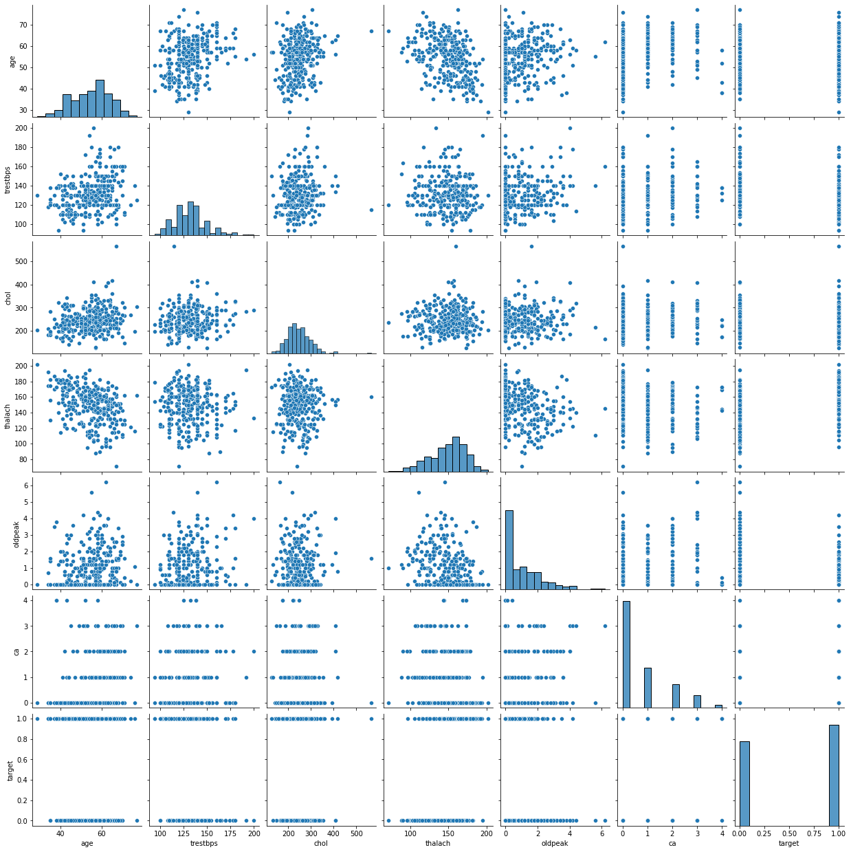
We can have an all-in-one plot to show the relationship between all variables and target outcome.
1
2
sns.pairplot(data)
plt.show()
The next few cells execute the usual machine learning process, preparing the data, finetune paramters using randomized grid search and use the best model to be evaluated on the test dataset.
1
2
3
4
5
# Data preprocessing and preparation
data = pd.get_dummies(data, drop_first=True)
X = data.drop('target', 1)
Y = data['target']
X_train, X_test, y_train, y_test = train_test_split(X, Y, test_size = .2, random_state=10) #split the data
1
2
3
4
5
6
7
8
9
10
11
12
13
14
15
16
17
# Hyperparameters tuning
max_features = ['auto', 'sqrt']
max_depth = [int(x) for x in np.linspace(1, 10, num = 10)]
max_depth.append(None)
min_samples_split = [2, 3, 4, 5]
min_samples_leaf = [1, 2, 4]
bootstrap = [True, False]
random_grid = {
               'max_features': max_features,
               'max_depth': max_depth,
               'min_samples_split': min_samples_split,
               'min_samples_leaf': min_samples_leaf,
               'bootstrap': bootstrap}

model = RandomForestClassifier()
random_search = RandomizedSearchCV(model, param_distributions=random_grid, cv = 3, n_iter=100, scoring='roc_auc', n_jobs=-1, random_state=42)
random_search.fit(X_train, y_train)
1
2
3
4
5
6
7
8
9
RandomizedSearchCV(cv=3, estimator=RandomForestClassifier(), n_iter=100,
                   n_jobs=-1,
                   param_distributions={'bootstrap': [True, False],
                                        'max_depth': [1, 2, 3, 4, 5, 6, 7, 8, 9,
                                                      10, None],
                                        'max_features': ['auto', 'sqrt'],
                                        'min_samples_leaf': [1, 2, 4],
                                        'min_samples_split': [2, 3, 4, 5]},
                   random_state=42, scoring='roc_auc')
1
2
3
4
5
6
7
8
9
10
11
12
13
14
15
16
17
18
19
20
21
22
23
24
25
26
27
28
29
30
31
32
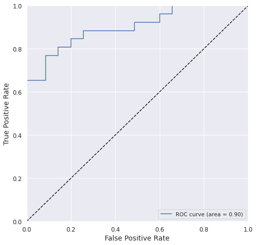
# Best Model evaluation
model = random_search.best_estimator_
sns.set()
y_train_pred = model.predict(X_train)
y_test_prob = model.predict_proba(X_test)[:,1]
y_test_pred = np.where(y_test_prob > 0.5, 1, 0)
roc_auc = metrics.roc_auc_score(y_test, y_test_prob)
plt.figure(figsize = (8,8))
plt.tick_params(axis = 'both', which = 'major', labelsize = 12)
fpr, tpr, _ = metrics.roc_curve(y_test, y_test_prob)
plt.plot(fpr, tpr, label='ROC curve (area = %0.2f)' % roc_auc)
plt.plot([0, 1], [0, 1], 'k--') # coin toss line
plt.xlabel('False Positive Rate', fontsize = 14)
plt.ylabel('True Positive Rate', fontsize = 14)
plt.xlim([0.0, 1.0])
plt.ylim([0.0, 1.0])
plt.legend(loc="lower right")
plt.show()
print('\tAccuracy_train: %.4f\t\tAccuracy_test: %.4f' %\
(metrics.accuracy_score(y_train, y_train_pred),\
metrics.accuracy_score(y_test, y_test_pred)))
print('\tPrecision_test: %.4f\t\tRecall_test: %.4f' %\
(metrics.precision_score(y_test, y_test_pred),\
metrics.recall_score(y_test, y_test_pred)))
print('\tROC-AUC_test: %.4f\t\tF1_test: %.4f\t\tMCC_test: %.4f' %\
(roc_auc,\
metrics.f1_score(y_test, y_test_pred),\
metrics.matthews_corrcoef(y_test, y_test_pred)))
1
2
3
	Accuracy_train:  0.9876		Accuracy_test:   0.8197
	Precision_test:  0.7586		Recall_test:     0.8462
	ROC-AUC_test:    0.9000		F1_test:         0.8000		MCC_test: 0.6399
We got a pretty good model with acceptable accuracy and ROC AUC.
Global Intepretation using SHAP
SHAP (stdands for SHapley Additive exPlanations) is a method to explain a prediction and quantify the impact of each feature on the outcome of the model through computing Shapley values from coalitional game theory. Read more about SHAP here.
As our model in Tree-based, we will use TreeExplainer to explain our model’s predictions.
1
2
3
import shap
explainer = shap.TreeExplainer(model)
shap_values = explainer.shap_values(X_test)
We start with a general feature importance to measure the magnitude of feature attributions and it’s measured as the mean absolute of Shapley values.
1
shap.summary_plot(shap_values[1], X_test, plot_type="bar")
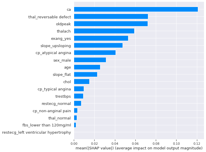
The number of major vessels seems to be the most important features, changing the predicted absolute heart disease probability on average by 13%. To get more details beyond importrance, let’s look at the SHAP summary Plot. It combines features importance and their effects on each instance.
1
2
#We can use a `summary_plot` to plot our Shapely Values for class `1`
shap.summary_plot(shap_values[1], X_test)
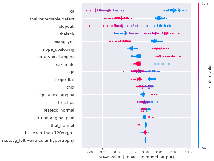
We can clearly see that many features separate cases with or without heart disease. For example, having a low number of major vessels, being a female, having a The reversable defect thalassemia, having a flat slope of the peak exercice ST segment, is more likely to increase the probability and the risk of having a heart disease. However, keep in mind that these effects describing the model are not necessary casual in the real world.
1
shap.dependence_plot('ca', shap_values[1], X_test, interaction_index=None)
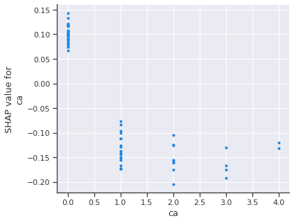
Again, A low number of major vessels is most likely to increase the risk of heart disease. Let’s add the feature with the strongest interaction with our most important feature.
1
shap.dependence_plot('ca', shap_values[1], X_test)
1
Passing parameters norm and vmin/vmax simultaneously is deprecated since 3.3 and will become an error two minor releases later. Please pass vmin/vmax directly to the norm when creating it.
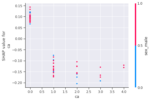
As we can see, generally, The accurence of reversable defect thalassemia decrease the predict heart disease.
An other interesting SHAP plot is the force plot. It clusters similar instances using hierarchical agglomerative clustering. Each position on the x-axis is an instance of the data. Red SHAP values increase the prediction, blue values decrease it. We can hover over instance to see why each person ended up either positively or negatively diagnoseed with heart disease.
1
2
shap.initjs()
shap.force_plot(explainer.expected_value[1], shap_values[1], X_test)

Have you run `initjs()` in this notebook? If this notebook was from another user you must also trust this notebook (File -> Trust notebook). If you are viewing this notebook on github the Javascript has been stripped for security. If you are using JupyterLab this error is because a JupyterLab extension has not yet been written.
Some clear clusters stand out, the one in the center and other one in the right. Both groups have higher chances of having heart disease.
Local Intepretation using SHAP
In the case of local interpretation, we can select couple of instances of interest, such as outliers or instances meeting a specific criteria. For our case, let’s select random 10 instance with some false negative points.
1
2
3
4
5
6
7
8
9
10
11
12
13
14
15
16
#Get indexes for a Group of Points
sample_test_idx = X_test.index.get_indexer_for(X_test.sample(10).index)

#To highlight False Negatives from these points
FN = (y_test_pred[sample_test_idx] == 0) &\
     (y_test.iloc[sample_test_idx] == 1).to_numpy()
#Set the expected value for the positive class
expected_value = explainer.expected_value[1]

#Reset matplotlib style so trat it's not seaborn's
# sns.reset_orig()
# plt.rcParams.update(orig_plt_params)

#Display decision plot with FN highlighted
shap.decision_plot(expected_value, shap_values[1][sample_test_idx],\
                   X_test.iloc[sample_test_idx], highlight=FN)
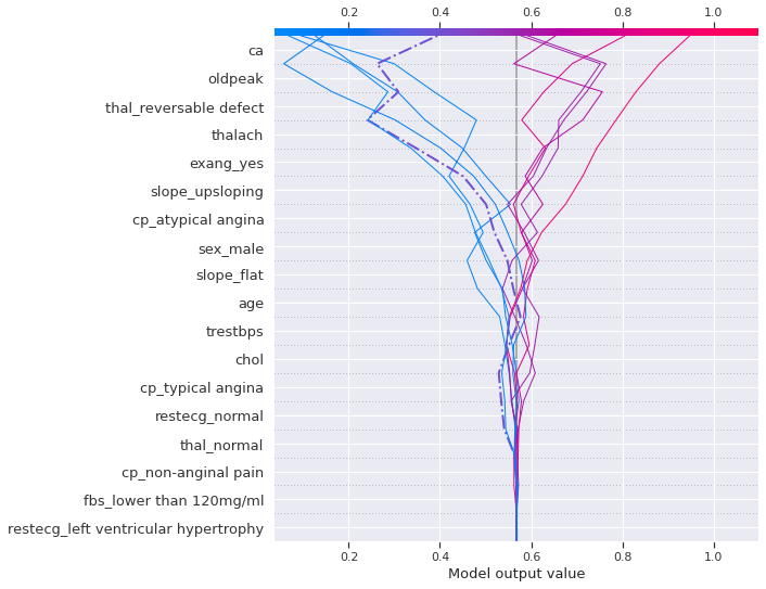
The left highlighted instance (dashed-dotted line), which is a positive heart disease, was on the right side of the expected value until slope_flat then start decreasing again but it it started increasing again when the exercise induced angina occured and thalassemia was reversable defect, then finally the likelihood when reached the number of major vessels
We can look at a force plot for on instance of interest to have an idea about what weighted in the model’s decisions. let’s compare a positive and a negative case.
1
2
3
#positive case with heart disease
shap.force_plot(expected_value, shap_values[1][X_test.index==126],\
                X_test[X_test.index==126])
Have you run `initjs()` in this notebook? If this notebook was from another user you must also trust this notebook (File -> Trust notebook). If you are viewing this notebook on github the Javascript has been stripped for security. If you are using JupyterLab this error is because a JupyterLab extension has not yet been written.
1
2
3
#negative case without heart disease
shap.force_plot(expected_value, shap_values[1][X_test.index==184],\
                X_test[X_test.index==184])
Have you run `initjs()` in this notebook? If this notebook was from another user you must also trust this notebook (File -> Trust notebook). If you are viewing this notebook on github the Javascript has been stripped for security. If you are using JupyterLab this error is because a JupyterLab extension has not yet been written.
From the compared two instances, a low ST depression (oldpeak), absence of reversable defect thalssemia, having an upsloping slope of the peak exercise ST, absence of major vessels had a large weight on maximizing the likelihood of have the heart disease. However, the occurence of absence of reversable defect thalssemia and a maximum heart rate around 128 tend to lower the chances of having the heart disease.
Local Intepretation using LIME
1
2
3
4
5
6
import lime
from lime.lime_tabular import LimeTabularExplainer

explainer = lime.lime_tabular.LimeTabularExplainer(X_test.values,\
                        feature_names=X_test.columns, \
                        class_names=['Not Heart Disease', 'Heart Disease'])
1
2
3
4
#positive case with heart disease
explainer.explain_instance(X_test[X_test.index==10].values[0],\
                                    model.predict_proba, num_features=6).\
                                    show_in_notebook(predict_proba=True)
1
2
3
4
# negative case without heart disease
explainer.explain_instance(X_test[X_test.index==219].values[0],\
                                    model.predict_proba, num_features=6).\
                                    show_in_notebook(predict_proba=True)
As concluded from SHAP and according LIME’s local surrogate, absence of major vessels and having an upsloping slope of the peak exercise ST have major contribution to increase the heart disease likelihood.
Conclusion
Machine learning interpretability is rapidly changing, and expanding field. In general, the widespread acceptance of machine learning interpretability techniques will motivate businesses to invest more in machine learning and artificial intelligence adoption in real world applications and in our day-to-day lives.